Project 2
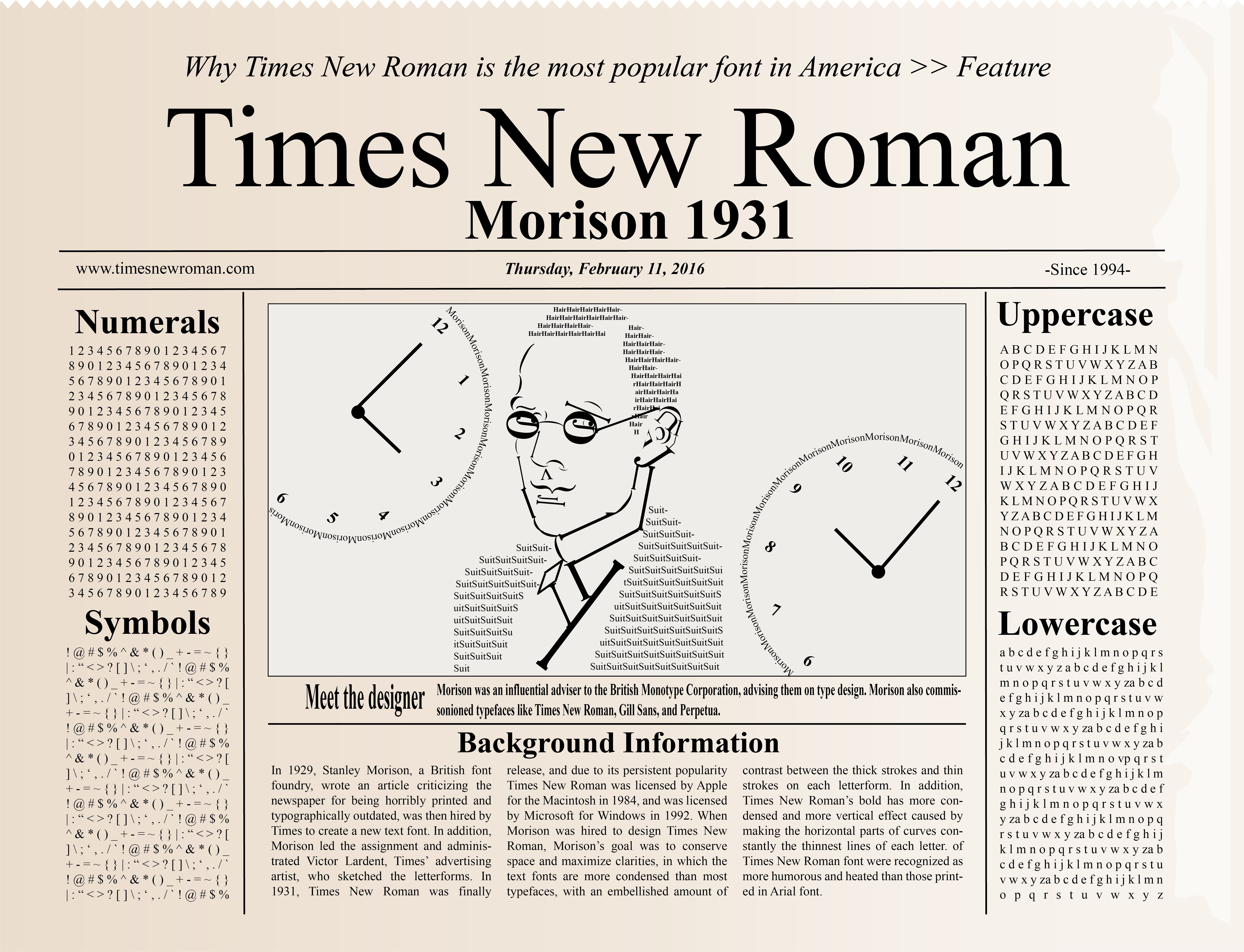
This poster was a typography poster I have to make in design 16. We have to make a poster according to the font we picked. The font I picked was Times New Roman. It was hard at first to figure out what kind of design I would like to create because there was a lot of information to research for me to get inspired. So I decided to dig deeper into the history of the font.
I found that Times New Roman was incorporated into a newspaper. I then got inspired by that, and I created a newspaper like format for this poster. It was very challenging at first because I did not know how to outline everything using Adobe Illustrator so I googled everything and the ending result was very satifying. Another challenge that came up was that I had an empty space in the middle of the poster so I thought of using letters to create the font's creator.