Blog Post #1 AIGA Design Conference Web Design Critique
10/05/2016
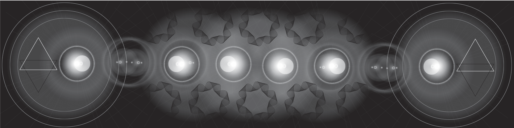
When I first entered the website for AIGA Design Conference the unbalance color of the
background caught my eyes first, then the disorientated title. I wasn’t a fan of the color choice
because I didn’t think red and sky blue goes well together, and the title of the website confused
me because I wasn’t sure if I should read it horizontally or vertically. The moving image of the
website was weird and confusing because I wasn’t sure if it has anything to do with the design
conference. As I was scrolling through the website I can kind of tell that it has something to do
with the design conference because of the rainbow rocks and the conference pictures. The
usability of the website was average, nothing interesting buttons I have noticed. The three things
the website does well was the adding the images setting that allow the user to scroll vertically
instead of horizontally, providing the information user needed as they scroll through the website,
and containing a search button that allows the users to search for the information they needed.
The three things the website didn’t do well was choosing the wrong color, inserting unrelated
moving image in the background, and selecting disorientated title.
Blog Post #2 Coffee Shop Process
10/10/2016

The coffee shop exercise was a success because as I was following the directions of the
of the exercise, I browser check after every step to insure I did not make any errors when I was
coding. However, I still made mistakes when I was coding CSS on footer and article, I inputted
the pixel in padding which made my text disappeared. I didn’t understand many tags in CSS and
HTML such as float, clear, Adobe Photoshop color code, nav, article, and section. I also don’t
apprehend how big the pixel size is supposed to be. Other than that, I understand more than half
of what I have done throughout the exercise, everything went very smooth and well; thanks to
the clear directions. I think I will process in the future to do better next time by reading the
textbook ahead or google it to comprehend more HTML and CSS tags because everything I need
to know will be online and in textbook.
Blog Post #3 A-List Apart Article
10/24/2016
One essential important information I learned from this article is that having styling
bubbles in the web page really do enhanced the visual quality of the web. The styling bubbles
also create the visual hierarchy where you start and stop where the circle is at. I find it interesting
that the shape placement of the bubbles is really complicated to figure out because it requires
approximate pixel to position the circle next to the text without covering the text. The article
taught me that you don’t need non-rectangular float shapes and feature queries. Even though I
like how the overall layout look but one thing I don’t understand is that will the layout still look
clean if I include a big block of text next to the circle, and the approximate pixel of the circle
should be in order to fit next to the text. Overall, I believe this article can help me in the future
when company hired me to help them create clean organized web page with images, and it will
make the web page look sophisticated.
Blog Post #4 Active Theory
11/09/2016
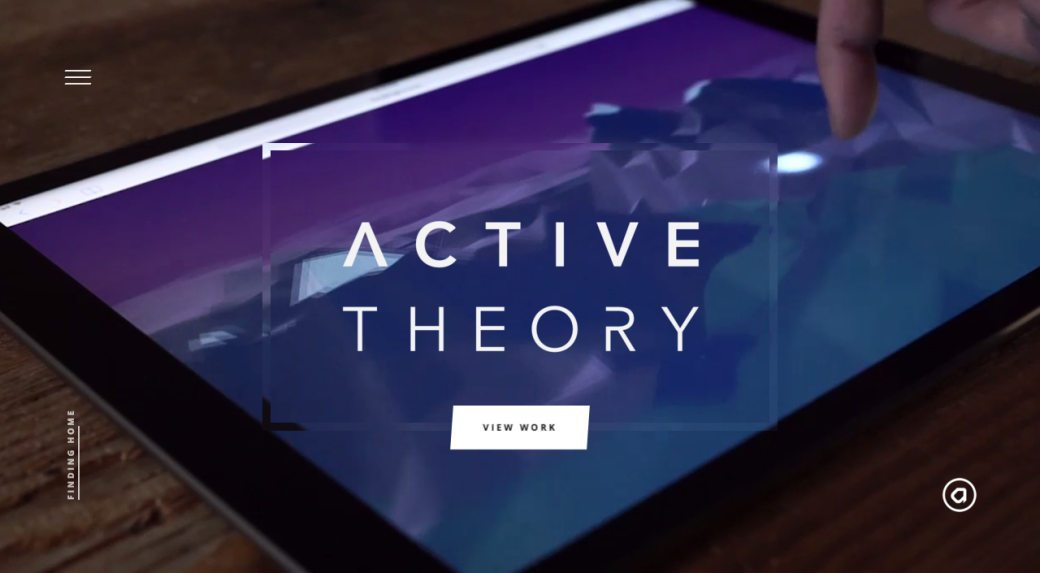
Active Theory is a 3-dimensional, responsive experience website. The website is set in a
3-dimensional active setting that proposes threat and features originally-scored music and a
interactive soundscape. All three breakpoints were legible to read; I can tell what the hierarchy
are at each breakpoint. The usability of each breakpoint of the website was an operational
because every button and the interactive system of the website was a success; there are no
buttons that did not work. I can clearly tell how the navigation work even though it was
confusing for me in the beginning because there were no instructions on what the website can do.
I do wish that they have a teaching preview on what the website contains. When I was checking
each breakpoint I notices that the views from the computer and iPad was basically the same,
however, when it comes to the breakpoint of an iPhone I can tell that the background of each
navigation was cut off a little, but still readable. Overall, I like the breakpoint from the computer
better I do not have to scroll as much as the other breakpoint because the screen is bigger.